Building a Brand Identity That Lasts
You can’t just piece together a brand identity like Frankenstein’s Monster. Mad science comes with consequences, so leave the spare parts in the graveyard. Using many folks favorite holiday—Halloween—as a case study, this blog will help you build a brand identity that won’t fall apart at the seams.
Halloween is well-loved because it’s engaging and easy to pick out of a lineup. When you spot orange and purple next to each other or a skull—hold the crossbones—you already know what you’re looking at before a single word has been exchanged. This is the kind of brand recognition you want.
Imagery
In this section we’ll cover what makes an iconic emblem—or in the case of a business, what makes an iconic logo.
Halloween is associated with tons of iconography: cobwebs, pumpkins, spiders, cats—but only the black ones—bats or witches flying through the sky, ghosts haunting graveyards and houses, candy, costumes, and even magic in general. This scope is way too broad for a brand and although all of these things are associated with Halloween, they won’t necessarily make you think of it without context.
However, Halloween does have one ace up its sleeve. The classic jack-o’-lantern. While several images are on theme and seem appropriate, the jack-o’-lantern is special because anywhere and anytime you see it you can’t avoid the association; that is exactly what you want.
The reason the jack-o’-lantern is successful is because it’s accessible, recognizable, and unique.
A good emblem or logo should represent the tone, mood, or theme of what it represents. The jack-o’-lantern captures the combination of spooky and fun that makes up the core of the holiday’s identity. Figure out what the mood of your brand should be and build a logo that distills it down into a simple and recognizable image.
Take a look at these images. They share the same color palette and basic composition, but they project different moods. The first is very obviously Halloween related—fun, spooky, a little mysterious—the second might be related, but I also might mistake it as generally fall related.
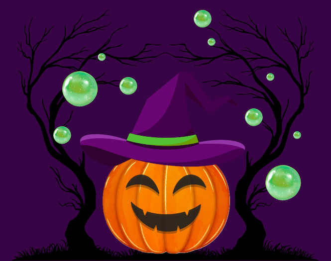
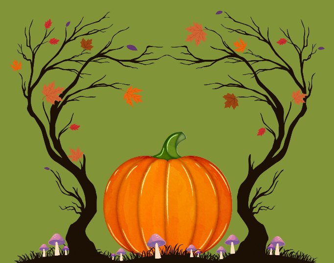
An image is famously worth a thousand words so the visual identity of your brand should be able to express your individuality on sight.
You don’t have to avoid everything that isn’t the jack-o’-lantern of your brand—have the witches and spiders too but make sure that your supporting imagery stays in its lane. Your primary brand image should always be the star so people can’t help but associate your image with your brand.
Color
Another thing that Halloween does really well is its limited color palette. The ideal number of colors to use for branding is around 3-5. This number gives you space to make interesting combinations that make your palette unique without becoming muddy or too complex to easily identify or remember.
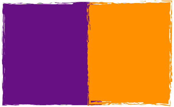
When choosing your color palette, focus on colors that are unified in some way. There are several ways to do this. Halloween has two primary colors, orange and purple. These are very different colors, but that’s what makes Halloween such a strong, identifiable palette: high contrast and unified chroma—which is a fancy word for the strength, vividness, saturation, and brightness of a color. Halloween is also associated with those specific shades of purple and orange.
What is the first thing you think of when you see these colors?
Now how about these ones?
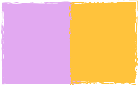
Both are clean, fun, minimal palettes. However, they project different tones and moods. They also likely remind you of different things. Even though both samples include the same relative colors, they evoke very different ideas. The first reminds me of Halloween, whereas the second palette makes me think more of Easter.
Know your hex codes and stick to them! This has two functions:
- Better recognizability.
- We all know . In fact, it’s so recognizable they were granted a trademark for it; no one else can have it but them!
- Consistency in branding and theming (particularly color!) make occasional departures more impactful.
- Keeping with the Reese’s example; they’ve occasionally changed the color of their packaging (e.g. yellow for Easter). Their color identity is well-established enough that this change makes the egg-shaped Reese’s pop out on the shelves without damaging the brand identity.
Apply this logic when you build a color palette for your own brand. Think about the feelings you want to invoke in your audience. Don’t pick a random shade, be consistent to curate a memorable identity for your brand. Pick a palette that your customer base can see out of context and suddenly they’re thinking of you.
Orange and purple are not the only colors in Halloween’s palette, but this is a great illustration of the difference between the primary colors in your palette—meaning the most important—versus your secondary and accent colors that round out your palette as a whole.
You should aim to have only one or two primary palette colors—these are your main players—one or two secondary colors, potentially an accent color, and neutrals that will give you a strong foundation.
At least one color in your palette should act as an anchor for the rest. For the Halloween palette, black and purple act as the anchors.
Halloween’s overall palette keeps purple and orange as its primary colors, black as a secondary, and that witch’s skin green as an accent. This sets it neatly within that 3-5 range with white as an unofficial neutral.
When you put it together it looks like this:
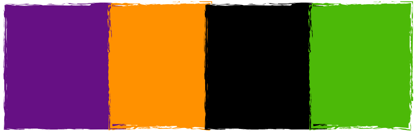
All you can think is: Halloween.
Your official palette typically doesn’t need to include black or white in the official lineup unless they’re your key players. Some examples of brands including black and white as key palette colors include: Sony, Adidas, Uber, Apple, etc. Halloween also includes black as a distinct part of its palette instead of being a supporting shade.
If you’re struggling to come up with a palette that feels interesting but still looks cohesive, start browsing around for ideas. A color dictionary is a great place to start for inspiration with the bonus of exercising your color theory muscles, so it becomes easier to do over time. You can also start with a color you know you want to use and use a color palette generator to help find compatible hues.
Interactive Elements
The final piece of Halloween’s appeal is the variety of interactive elements.
Think about all the activities that are associated with Halloween. Trick-or-treating, costume parties, pumpkin carving, haunted houses, and more.
Events and activities that allow your consumers to interact with your brand will increase your notoriety. A haunted house likely won’t do you any good, but consider an active social media presence, , or making in-person appearances at markets or conventions.
An engaged customer is far more likely to return again and again, so consider what events and activities make sense for the kind of brand you’re trying to build.
Putting It All Together
Apply these principles across your brand and the identity will take shape in front of your eyes. If you do it right, you’ll be remembered for years.